UI and customization
Changing parameters is straightforward and easy. You can have a tailor-made design and a smooth appearance within seconds. It is possible, among others, to adjust integrated player controls, icons, background color, add a poster, change the cursor etc. Of course, you can also disable all built-in styles. In this manual, we will go through customizable elements so that H5Live Player UI will suit all your needs.
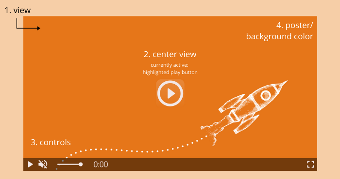
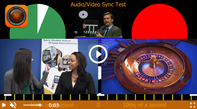
- view: video overlayer including visible styles, controls and poster/background.
- center view: can include play button [see example above], loading animation, mute/volume icon.
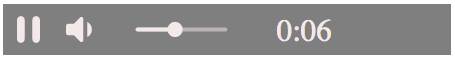
- controls: control bar with play/pause control, mute control, volume control (slider), playback time, fullscreen control.
- poster / background: a poster [image of your choice] that can be set and the background color can be changed.
Below you have a short description of each property and how-to for adjusting styles.
Built-in controls, animations and styles
The nanoStream H5Live Player Version 4.9.1 is introducing new possibilities in terms of design. The control bar and control icons background colors are customizable. The player is more vivid due to additional button behavior: buttonHighlighting, buttonAnimation and a variety of available cursors with buttonCursor. See the config here.
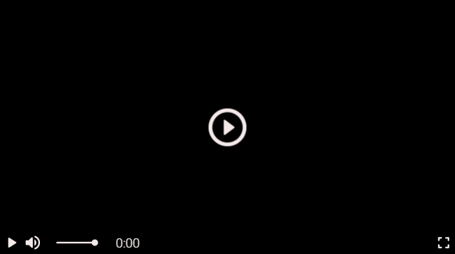
The default style of the player:
"symbolColor" and "controlBarColor"
In config.style.symbolColor you need to pass the value of the desired color. The default value is "rgba(244,233,233,1)".
The control bar color background is set by default to "rgba(0,0,0,0.5)". To change it, insert the string with desired color value in config.style.controlBarColor.
To change one of the colors, insert its value in one of the formats (all case insensitive):
- RGB e.g.
"rgb(255,165,0)"and with alpha"rgba(255,165,0,0.5)" - HEX e.g.
"#FFA500"or"#fa0"and with alpha"#FFA500AA"or"#fa0a" - HSL e.g.
"hsl(39,100%,50%)"and with alpha"hsla(39,100%,50%,0.5)" - valid CSS Keyword (e.g.
"pink"/"white"/"aquamarine")
Example with HEX color value for symbolColor and controlBarColor:
"style": {
        "symbolColor"     : "#ed7d0e",
        "controlBarColor" : "#000000FF"
}
Example with RGBA color value and transparency:
"style": {
        "symbolColor"     : "rgb(255,255,255)",
        "controlBarColor" : "rgba(237,125,14,0.8)"
}
"buttonHighlighting" and "buttonAnimation"
Both properties add the 3D effect to the player and make it more lively.
buttonHighlightingon hover activates a shadow container of the buttonbuttonAnimationon hover magnifies the button and bounces when clicked
The config.style.buttonHighlighting and config.style.buttonAnimation properties will either be:
trueby default, means that they are displayedfalseto have them disabled
Example
"style": {
    "buttonHighlighting" : false,
    "buttonAnimation"    : false
}
"buttonCursor"
To change the cursor, you can use any CSS cursor property, e.g:
"default""pointer""grab"
The default value is set to "pointer". To change it, implement the string with the desirable CSS cursor in config.style.buttonCursor
Example
"style": {
    "buttonCursor": "default"
}
Changing the default value to "default", resolves in a switch from the pointing finger to an arrow while hovering over a clickable element.
Poster
Poster images, which are displayed while the video element is loading, are supported and can be added in the config.style.poster. The string has to be a relative or absolute path to a valid image source like "./assets/poster.png" or image URL.
Example
"style": {
    "poster": "https://[yourdomain]/assets/niceimage.png"
}
Background color of the player
To change the background color of the player set the backgroundColor parameter in config.style.backgroundColor to the desired color. By default, it is set to "black".
"style": {
    "backgroundColor": "white"
}
Responsiveness
To make the player responsive and preserve the aspect ratio, you need to set up player configuration and the CSS of playerDiv.
Player configuration
Set the style.width and style.height properties inside the player config to auto to keep the size of the parent container.
// player config
    var config = {
        "style": {
            "width"  : "auto",
            "height" : "auto"
        },
        ...
    }
playerDiv CSS
Set a percentage value for padding-bottom to maintain the aspect ratio of the players <div> element.
For a 16:9 aspect ratio: (9 / 16 = 0.5625) = 56.25%
    <body>
        <div id="playerDiv" style="width:100%;padding-bottom:56.25%"></div>
    </body>
Other aspect ratios
| Aspect ratio | padding-bottom |
|---|---|
| 1:1 | 100% |
| 16:9 | 56.25% |
| 4:3 | 75% |
Other Customizations
To disable all custom properties in the player, e.g. in case you want to build your controls or display the video as a background without any icons, you can simply set the view to false in config.style.controls. In this way, you receive a plain video element.
"style": {
    "view": false
}
Disable built-in controls
Inline controls are set by default. However, it is possible to disable them by changing the value to false in config.style.controls.
"style": {
    "controls": false
}
Important If you create custom controls or other overlay elements make sure to set the z-index value > 10 to ensure they are positioned on top of the video layer.
Style as an audio-only player
To style the player as audio-only (without displaying the video element), it is enough to set the audioPlayer value to true in config.style.audioPlayer.
"style": {
    "audioPlayer": true
}
To customize audio-only control bar follow built-in controls customization.
Display audio-only stream
For audio-only stream, when there is no video, you can style the player to have a black background in the video frame and audio controls.
"style": {
    "displayAudioOnly": true
}
Hide fullscreen control
To hide fulscreen control icon set the fullscreen control to false in config.style.fullScreenControl.
"style": {
    "fullScreenControl": false
}
Other customizable parameters with a boolean value
It is possible to customize other parameters as well by setting them to true or false in config.style.[parameter], e.g.:
interactiveviewkeepFramecenterView
A list of all parameters available for styling can be found in NanoPlayer API in the config.style object.
Example code snippet with customization
In this example we want to change controlBarColor and symbolColor, replace the default buttonCursor and disable the buttonAnimation. In addition the playerDiv is styled responsive. For presentation, we insert all other customizable parameters within the style object. To try it out simply copy the snippet and paste it into a body of any HTML file (replace the streamname [your_streamname] with yours).
    <div id="playerDiv" style="width:100%;padding-bottom: 56.25%"></div>
    <script src="//demo.nanocosmos.de/nanoplayer/api/release/nanoplayer.4.min.js?20210127"></script>
    <script>
    var player;
    var defaultUrl = "rtmp://bintu-play.nanocosmos.de/play";
    var defaultServer = {
        "websocket": "wss://bintu-h5live.nanocosmos.de:443/h5live/stream",
        "hls": "https://bintu-h5live.nanocosmos.de:443/h5live/http/playlist.m3u8",
        "progressive": "https://bintu-h5live.nanocosmos.de:443/h5live/http/stream.mp4"
    };
    var streamNames = [
        "[your_streamname]"
    ];
    var config = {
        "source": {
            "startIndex": 0,
            "entries": [
                {
                    "index": 0,
                    "h5live": {
                        "server": defaultServer,
                        "rtmp": {
                            "url"        : defaultUrl,
                            "streamname" : streamNames[0]
                        }
                    }
                }
            ]
        },
        "playback": {
            "autoplay" : true,
            "automute" : true,
            "muted"    : false
        },
        "style": {
            "width"                : "auto",
            "height"               : "auto",
            "controls"             : true,
            "interactive"          : true,
            "view"                 : true,
            "scaling"              : "letterbox",
            "keepFrame"            : true,
            "displayAudioOnly"     : true,
            "audioPlayer"          : false,
            "displayMutedAutoplay" : true,
            "backgroundColor"      : "rgb(237,125,14)",
            "fullScreenControl"    : true,
            "centerView"           : true,
            "symbolColor"          : "#FFF",
            "controlBarColor"      : "rgba(237,125,14,0.8)",
            "buttonAnimation"      : false,
            "buttonHighlighting"   : true,
            "buttonCursor"         : "grab",
            "poster"               : ""
        },
    };
    document.addEventListener("DOMContentLoaded", function () {
        player = new NanoPlayer("playerDiv");
        player.setup(config).then(function (config) {
            console.log("setup success");
            console.log("config: " + JSON.stringify(config, undefined, 4));
        }, function (error) {
            alert(error.message);
        });
    });
    </script>